¶ Trend Viewer
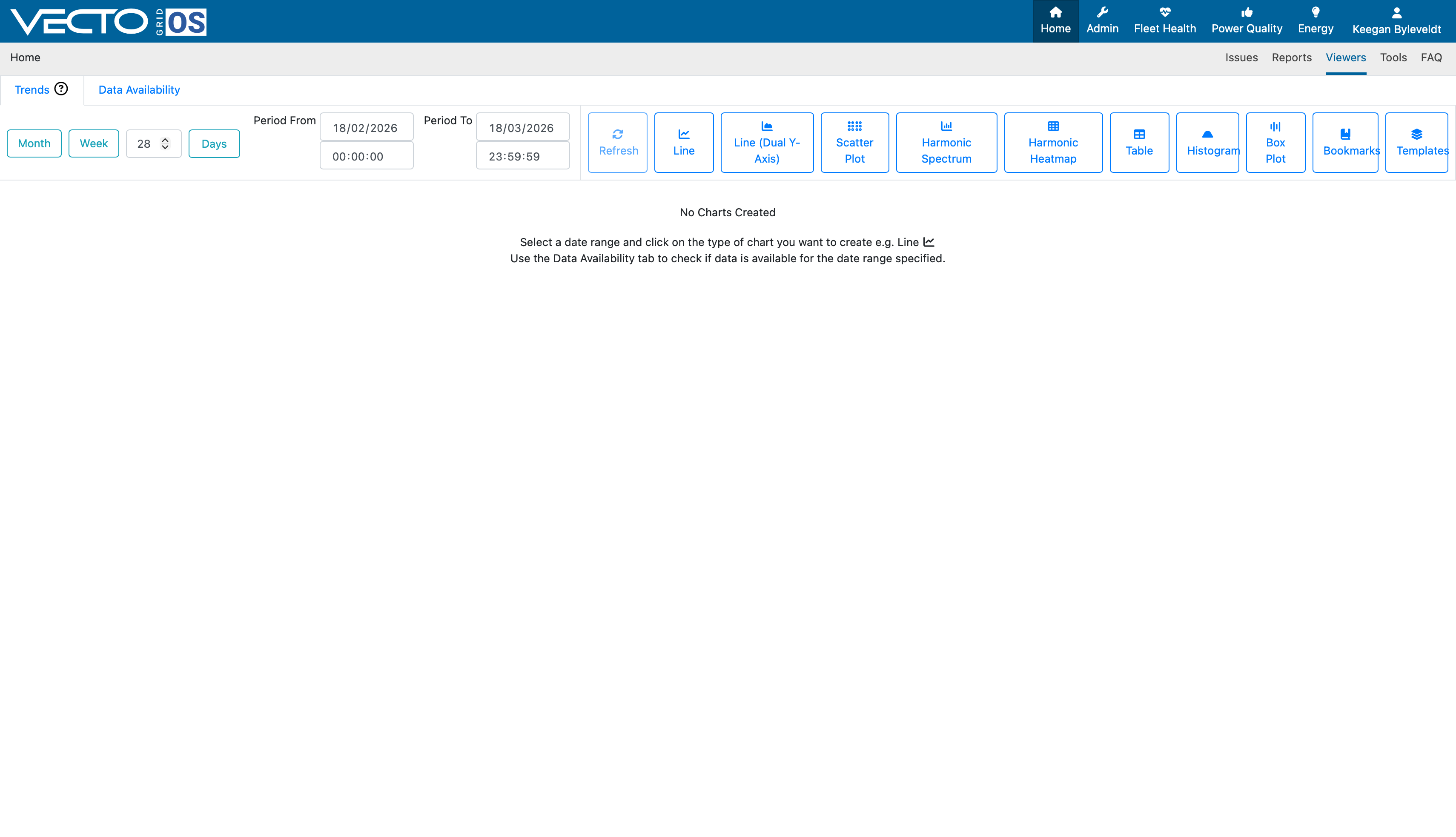
Upon selecting the "Trend" option, you are presented with the following window:
¶ Trend period slection
From the top banner, your first selesctions are as follows:
- Month: Select the closest full month of available data.
- Week: Select a week's worth of data to plot from the current date.
- Days: Select the amount of days from the current date to show trends.
Alternatively, you can select the exact dates you want to plot, by making use of the "Period From" and "Period To" fields. This allows the user to select exact hours, in cases of shorter measurement intervals.
¶ Line
The next selection you will find is the "Line" option. This allows you to plot Data Streams by means of a line chart.
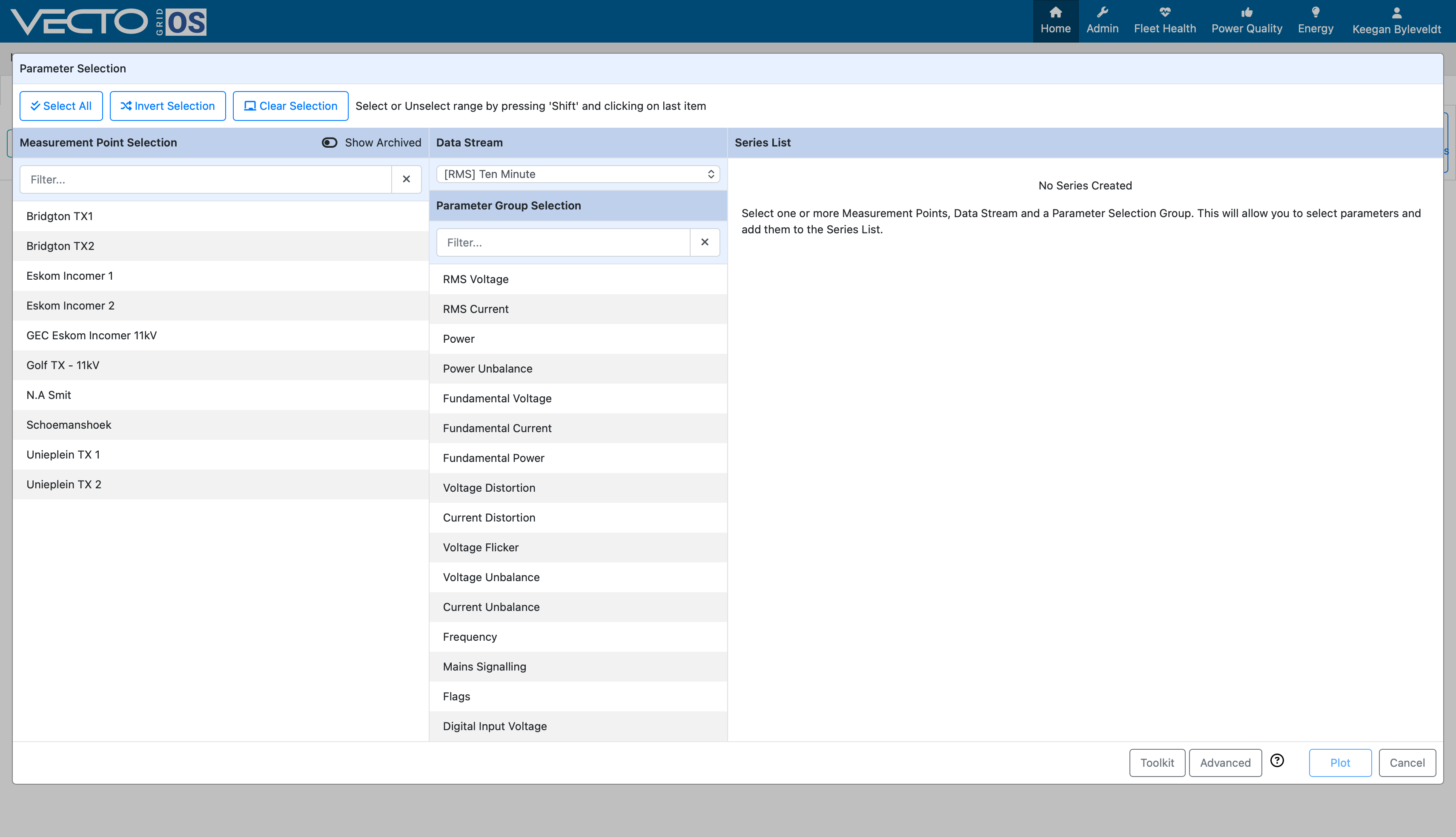
Once this window pops up, you are presented with all measurement points linked to your account. Select the relevant measurement point you want to show data trends for, and process to selecting the relevant Data Stream.
Please refer to the Data Availbility Viewer as well as Measurement Point Setup sections beforehand to ensure that you have the relevant Data Streams enabled.
Upon selecting the desired parameter, a panel appears at the bottom of the window allowing you to select charasteristics (Voltage as % of Declared, min/max values) of the signal, such as the channel that has been measured (Channel 1-4).
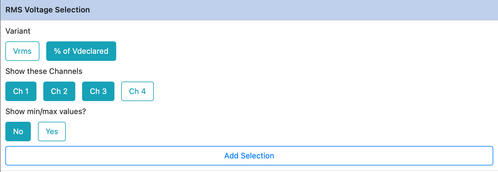

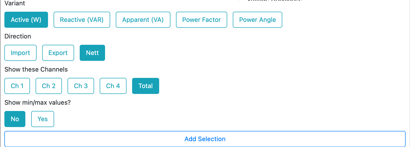
Examples of default selections are shown above for RMS voltage and Power. Once you have selected the desired characteristics, select "Add Selection" and the series is added.
Once you have added the desired selection, you will be able to change the colour of each parameter to be plotted.
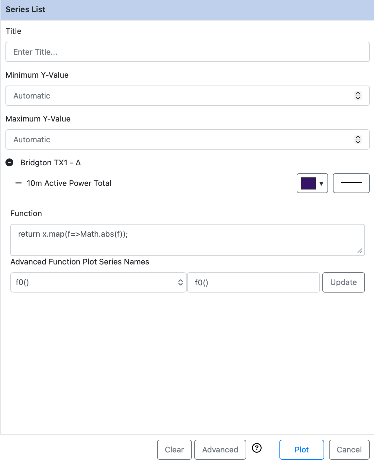
This panel allows you specify plot elements, such as adding a title and formatting Y-axis limits. Located on the bottom of the window is the "Toolkit" and "Advanced" panels. These panels work together to allow the user to apply advanced functions to the series.
In the example above an absolute function is applied to the 10-min Total Active Power in cases where the active power crosses zero (0). More information regarding the functions can be found by pressing the (?) symbol within Vecto Grid OS, located in the image above.
¶ Line (Dual Y-Axis)
This feature is the same as the Line feature, however you are able to plot two (2) quantities against time, with each quantity on its own Y-axis. All other functions, found in the previous section, are also true for this case.
¶ Scatter Plot
¶ Harmonic Spectrum
Harmonic spectrum allows you to view the harmonic spectrum for voltage, current and power as shown below.
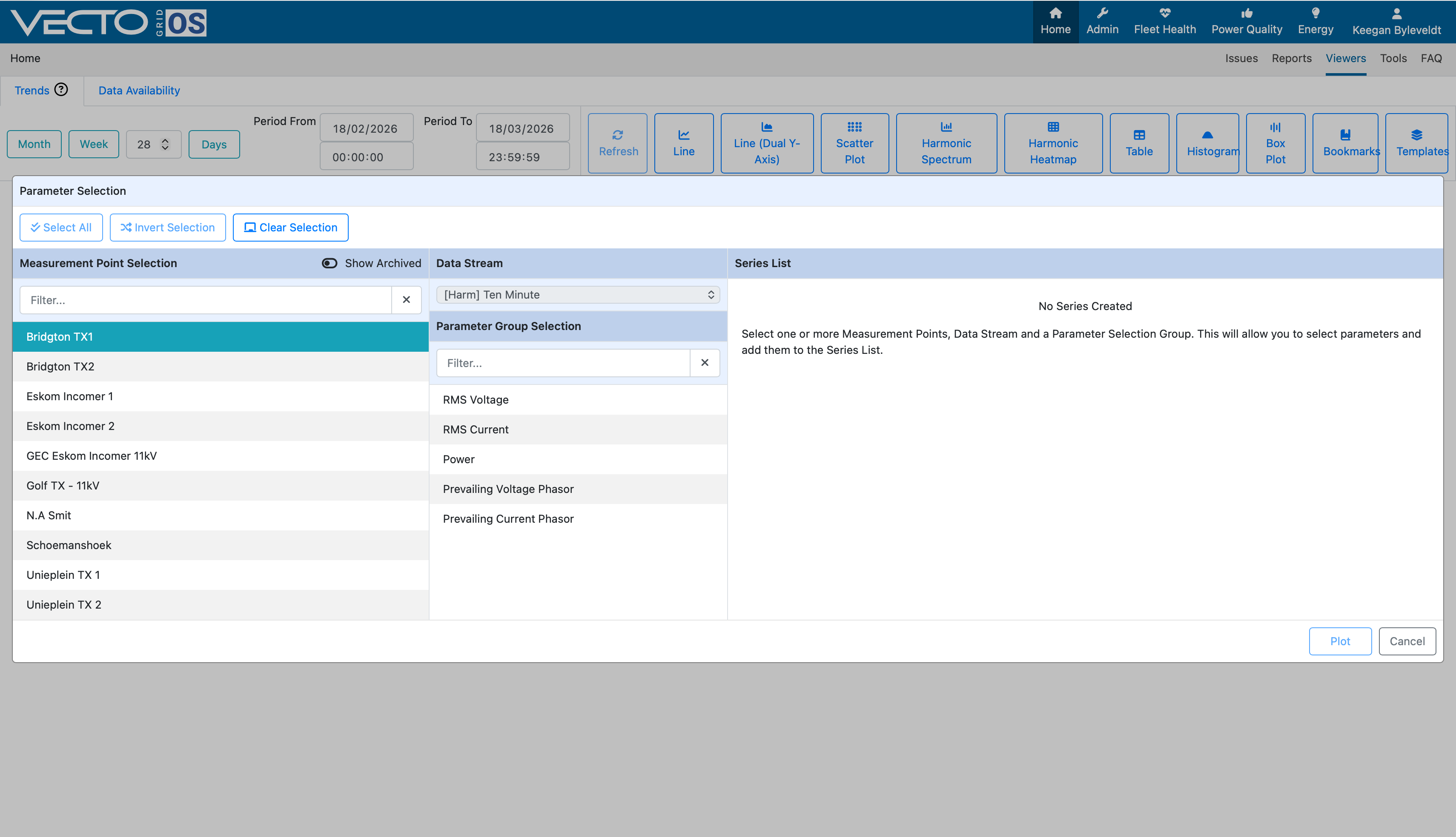
By default you will be able to view the harmonic spectrum up to the 49th harmonic consisting of only odd harmonics. Please contact CTLAB if you require even harmonics to be made loaded into Vecto GridOS.
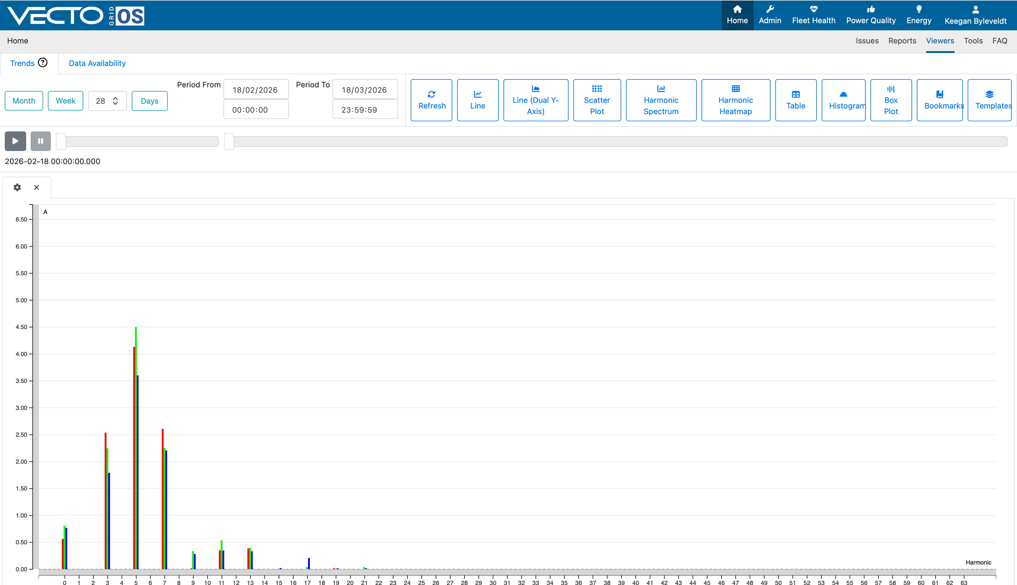
Once you plot the harmonic spectrum, you are able to play through the harmonic spectrum over time by selecting the play button. The speed at which Grid OS plays the data can be changed by moving the first slider. Moving the second, longer slider allows you to scrub through the data.
¶ Harmonic Heatmap>
¶ Table
This option allows you to create a table from a desired Data Stream. When the table is created, you are able to export the table as a comma seperated values (CSV) file for offline use and storage.
¶ Histogram
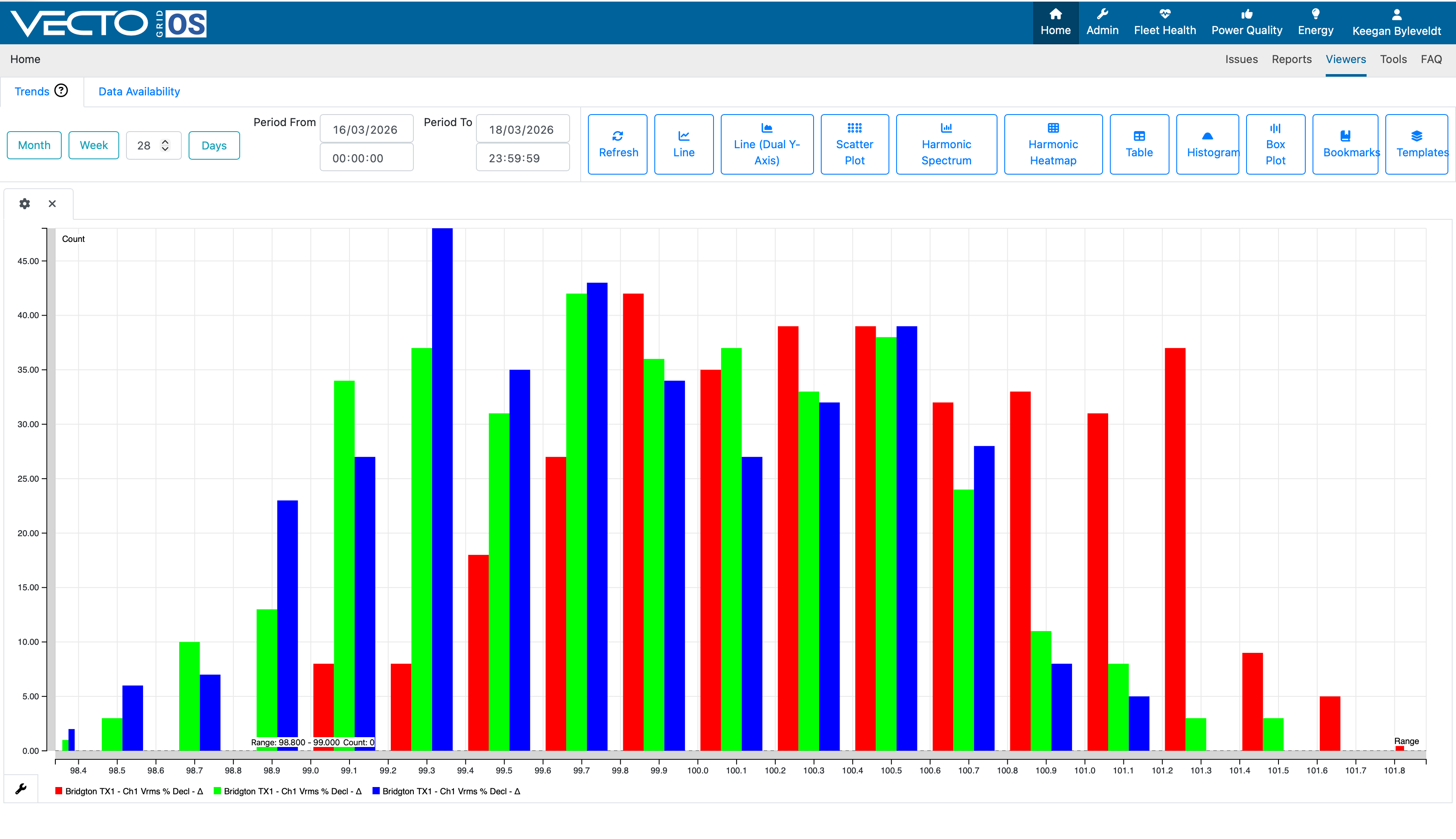
Vecto Grid OS allows you to create a histogram by allowing you to select a parameter, after which it creates bins and calculates the amount of samples that fit into specific bins.
¶ Box Plot
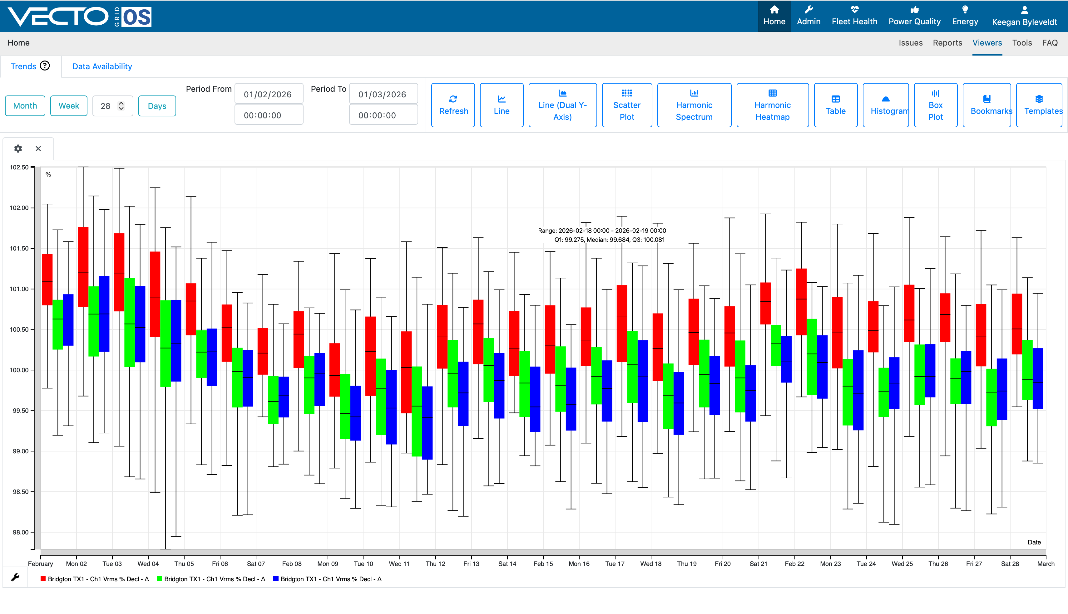
Making use of the Box Plot function allows you obtain the a visual representation of the upper/lower quartile data, as well as the median for each quantity. An example is shown below of a Box Plot done for RMS voltage.